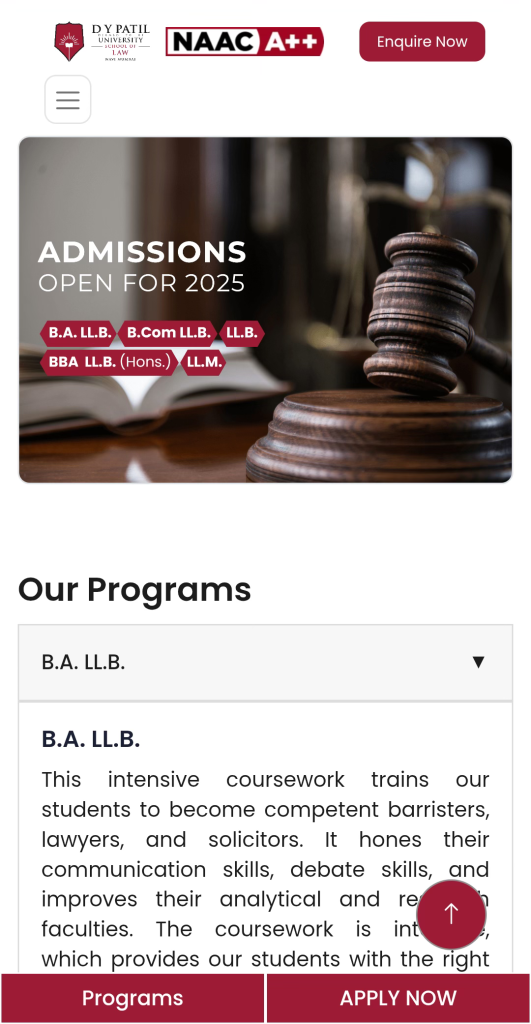
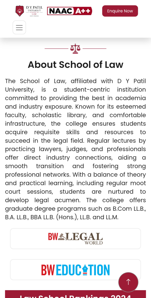
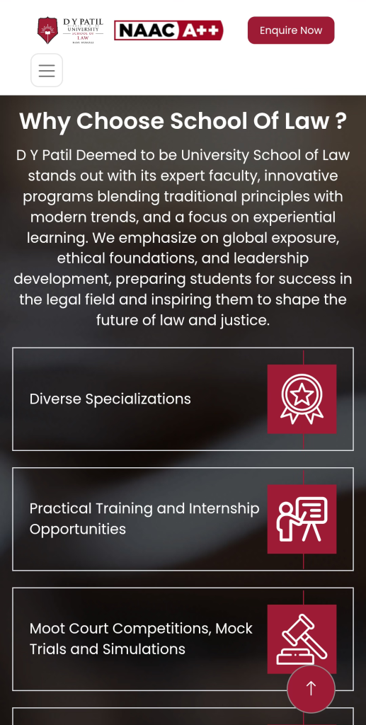
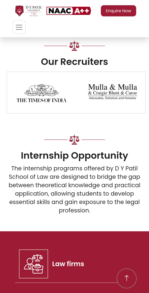
Unique website with a beautiful presentation of sustainability-oriented ideas
LOCATION
New Mumbai, IN
CLIENT
D. Y. Patil University
BUDGET
Confidential
INDUSTRY
Education
ENVIRONMENT
HubSpot
ACADEMIC YEAR
2024-25
LIVE
Check Live
PROBLEM
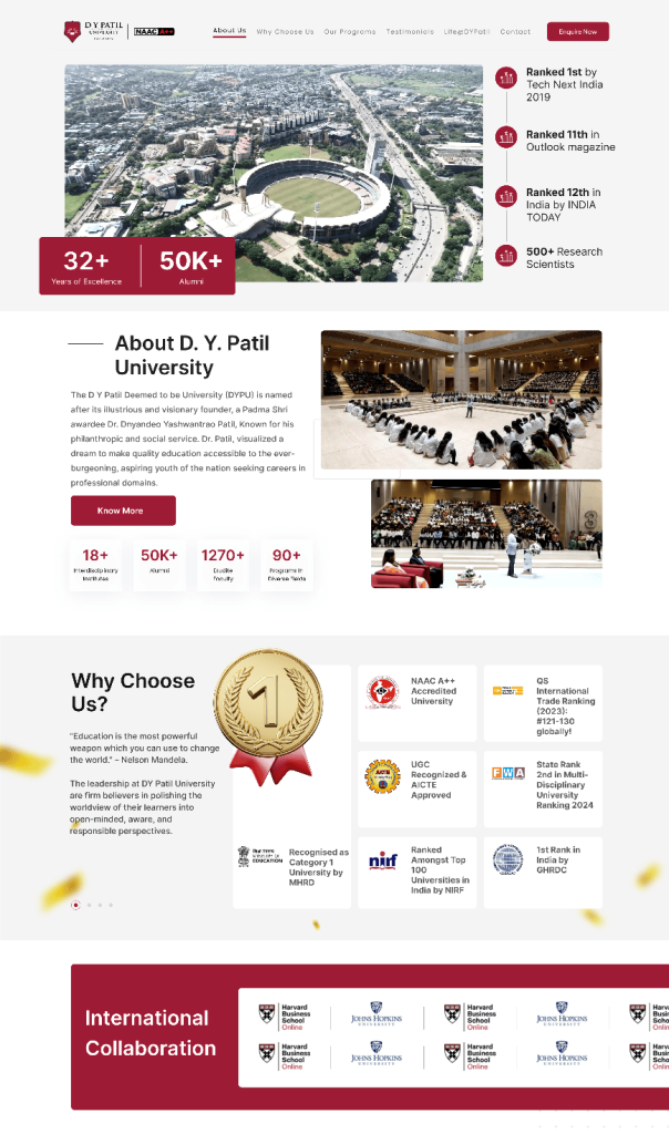
DY Patil University needed multiple program-specific landing pages to capture student inquiries effectively. Their existing pages were slow to load, causing drop-offs and limiting student engagement, especially on mobile devices.
SOLUTION
GladOwl designed and developed 6 high-performance landing pages with responsive layouts and optimised content. By applying advanced speed optimisation techniques, each page was structured to load quickly on mobile devices while delivering a smooth user experience for prospective students.
VALUE DELIVERED
Landing pages achieved an impressive 3-second load time on mobile, reducing bounce rates.
Students found it easier to browse programs and submit inquiries without delays.
The improved performance and streamlined design enhanced lead generation and supported the university’s admission campaigns.
Project Outcome
Our work in
numbers
+ 0
%
Website Traffic
+ 0
%
SEO Growth
+ 0
%
Page Speed
Motivation
Work
Inspiration
Shailendra
Founder & CEO
Team & Client
Management
Grande
Facilitative
Ajit
Project Manager
Content Creator
Best Bug
Detector
Ashwinee
Manager
Lead Generator
Solving Difficult
Problems
Shubham
Digital Marketing
Design Creator
Solving Difficult
Problems
Pratichi
UI & Graphic Designer
User Experience
Solving Difficult
Problems
Abrar
Web Developer & Team Mentor
Web Developer
Solving Digital
Problems
Ashish
Web Developer
Growth Strategist
Solving Difficult
Problems
Ershad
AVP - Growth
SLEEK YET INFORMATIVE
Where clarity meets
depth
The website presents a light and breezy design, yet it's rich in content. We carved out specific sections for detailed descriptions of Kaiterra’s offerings, supplementing their narrative with in-depth data like technical specifications, product features, and pricing.
A crucial addition is the unobtrusive button in the top-right corner, always visible for users to book a demo or schedule a consultation, without being intrusive.
BRANDING
Setting the tone
We opted for a cool, dark color scheme with a few base colors complemented by brighter contrasting tones. This combination created a website that's not only easy on the eyes but also conveys a sense of calm, sustainability, and professionalism. A notable feature is the use of linear technical drawings. These artistic illustrations add a creative flair to the website.
For Kaiterra’s revamped branding, oversized typography played a key role. We chose the Manrope font family, known for its aesthetically pleasing, geometric numbers, making it ideal for showcasing data.
Montserrat
Semibold
Regular
Light
#800003
#000000
#484848
#D9D9D9
A B C D E F G H I J K L M N
O P Q R S T U V W X Y Z
A B C D E F G H I J K L M N
O P Q R S T U V W X Y Z
Mobile
Optimal mobile experience
The mobile website's objective was to deliver a user experience as clean and refreshing as the air Kaiterra strives to purify. We prioritized optimizing mobile performance, ensuring the site was fast and user-friendly. Additionally, we emphasized Kaiterra's unique branding by using a visually striking combination of deep midnight blue and white backgrounds.